

We've integrated our platform with Twitter Bootstrap version 2.3.2 to make is easier to build beautiful, custom jobs in the Code Editor. This article describes how to use the Twitter Bootstrap Framework when building a job in Appen.
This is a job that uses Bootstrap extensively:
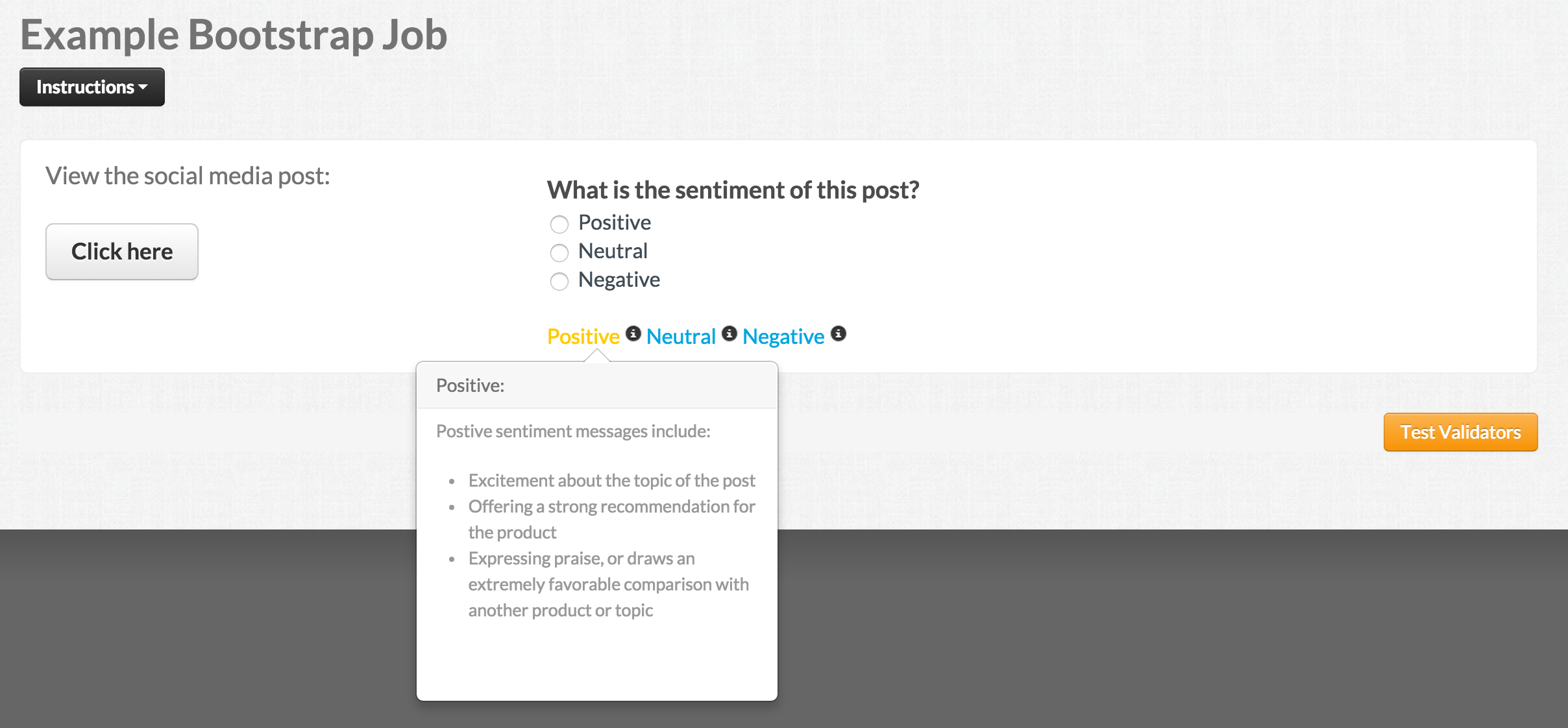
Fig. 1: Job with Bootstrap elements
And here’s the same job, with Bootstrap elements called out:
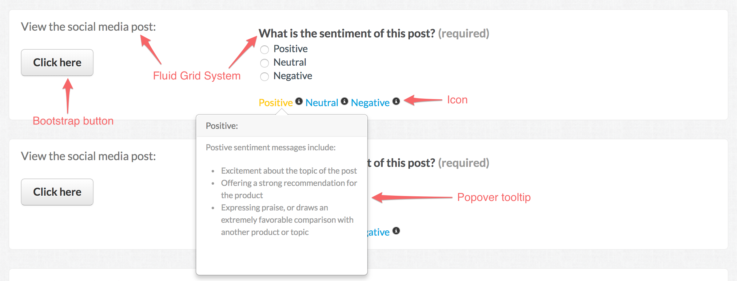
Fig. 2: Job with Bootstrap elements called out
Here's a preview of the entire code for this job:
CML:
<!-- Create Bootstrap's fluid grid system for the job interface. The grid contains a maximum of 12 top level columns. -->
<div class="row-fluid">
	<!-- Create first column that spans 4 columns. -->
	<div class="span4">
		<h4>View the social media post:</h4>
		<br/>
		<!-- Create button link using the class 'btn' and making the button a large size using the class 'btn-large' -->
		<a href="{{url}}" class="btn btn-large">Click here</a>
	</div>
	<!-- Create second column that spans 8 columns. -->
	<div class="span8">
		<cml:radios label="What is the sentiment of this post?" name="sentiment" validates="required">
		<cml:radio label="Positive" value="positive"/>
		<cml:radio label="Neutral" value="neutral"/>
		<cml:radio label="Negative" value="negative"/>
		</cml:radios>
	<!-- Create popover tooltips that are enabled on hover. Reference tooltip information using a custom class name, e.g. 'positive_tip'. -->
		<a target="_blank" class="positive_tip">
		<!-- Add a Bootstrap icon glyph using the <i> tag and class 'icon-info-sign' for the information icon. List of icons here: http://getbootstrap.com/2.3.2/base-css.html#icons -->
		Positive <i class="icon-info-sign"/>
		</a>
		<a target="_blank" class="neutral_tip">
		Neutral <i class="icon-info-sign"/>
		</a>
		<a target="_blank" class="negative_tip">
		Negative <i class="icon-info-sign"/>
		</a>
	</div>
</div>
JavaScript:
//Require the latest version of jQuery and the Bootstrap popover plugin
require(['jquery-noconflict', 'bootstrap-popover'], function (jQuery) {
  //Ensure MooTools is where it must be
  Window.implement('$', function (el, nc) {
    return document.id(el, nc, this.document);
  });

  var $ = window.jQuery;

  //Begin tooltip popovers: http://getbootstrap.com/2.3.2/javascript.html#popovers
  $('.positive_tip').popover({
    html:true,
    placement:'bottom',
    trigger:'hover',
    title:'Positive:',
    content:'<p>Postive sentiment messages include: <ul><li>Excitement about the topic of the post</li><li>Offering a strong recommendation for the product</li><li>Expressing praise, or draws an extremely favorable comparison with another product or topic</li></ul></p>',
  });
});
Now let's break down each Bootstrap piece of this job!
How to add the Grid Layout and Button:
Start by reading up on Bootstrap’s Grid System and Buttons. Then, it’s as simple as referencing these Bootstrap elements in your CML.
Create Bootstrap's fluid grid system for the job interface. The grid contains a maximum of 12 top level columns.
<div class="row-fluid">
The first column that spans 4 columns is created with the class, 'span4'. Create a button link using the class 'btn' and making the button a large size using the class 'btn-large'.
	<div class="span4">
		<h4>View the social media post:</h4>
		<br/>
		<a href="{{url}}" class="btn btn-large">Click here</a>
	</div>
The second column spans 8 columns, and is created with the class, 'span8'.
	<div class="span8">
		<cml:radios label="What is the sentiment of this post?" name="sentiment" validates="required">
		<cml:radio label="Positive" value="positive"/>
		<cml:radio label="Neutral" value="neutral"/>
		<cml:radio label="Negative" value="negative"/>
		</cml:radios>
	</div>
</div>
How to add the Icons:
No surprises here. It all starts with the Bootstrap Docs on icons.
Add a Bootstrap icon glyph using the <i> tag and class 'icon-info-sign' for the information icon.
Positive <i class="icon-info-sign"/>
How to add the Popovers:
Everything’s been simple so far, right? Now things gets a bit more complicated with the popovers.
Create popover tooltips that are enabled on hover. Reference tooltip information using a custom class name, e.g. 'positive_tip'.
<a target="_blank" class="positive_tip">
	Positive <i class="icon-info-sign"/>
</a>
<a target="_blank" class="neutral_tip">
	Neutral <i class="icon-info-sign"/>
</a>
<a target="_blank" class="negative_tip">
	Negative <i class="icon-info-sign"/>
</a>
The tricky part comes in with the Javascript. Here’s what you’ll need to include in the Javascript section of the job editor:
First, we'll need to require the latest version of jQuery and the Bootstrap popover plugin for our popovers to work.
require(['jquery-noconflict', 'bootstrap-popover'], function (jQuery) {
Next, we ensure that MooTools is implemented correctly.
  Window.implement('$', function (el, nc) {
    return document.id(el, nc, this.document);
  });

  var $ = window.jQuery;
Finally, we begin the popover tooltip section that allows HTML content, and appears below the text on hover. For more info on popover tooltips, please view the following Bootstrap article: http://getbootstrap.com/2.3.2/javascript.html#popovers
  $('.positive_tip').popover({
    html:true,
    placement:'bottom',
    trigger:'hover',
    title:'Positive:',
    content:'<p>Postive sentiment messages include: <ul><li>Excitement about the topic of the post</li><li>Offering a strong recommendation for the product</li><li>Expressing praise, or draws an extremely favorable comparison with another product or topic</li></ul></p>',
  });
});
This is a small set of what’s possible with Bootstrap integration. We hope you enjoy these new tools, and we’d love hear from you if you build jobs that use Bootstrap in an exciting way.